Official Themes
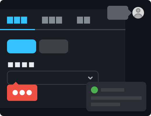
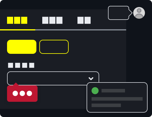
React Suite officially provides the following 3 themes by default, you only need a simple configuration to use.
light: Light theme (default).dark: Dark theme. It is usually called the night mode 🌘, to darken the tone in a low-light environment to relieve visual fatigue.high-contrast: High contrast theme. It uses a limited color palette with contrasting colors to make an interface easier to use. It's useful when users have photosensitivity or contrast issues, as well as in low-light environments.


Usage
1. Import style files
@import '~rsuite/dist/rsuite.min.css';If you use Less, you need to enable the corresponding theme through a variable.
@import '~rsuite/styles/index.less';

// Enable dark mode
@enable-dark-mode: true;

// Enable high contrast mode
@enable-high-contrast: true;
☆ We recommend you to use Less, because it will only load the styles of the corresponding theme when you compile the generated CSS, thereby reducing the size of the CSS file.
2.CustomProvider
If your application has been included in the <CustomProvider> container, then you only need to add another theme attribute and configure your corresponding theme name.
function App(props) {
  return <CustomProvider theme="dark">{props.children}</CustomProvider>;
}
<CustomProvider> will add a global className to the <body> element during the component rendering process, so that the child elements will act on the corresponding theme style.
If you want to change the theme of only a part of the component, just add the .rs-theme-dark class or the .rs-theme-high-contrast class to any container element to use the corresponding theme style .
Customization
If the themes provided above cannot meet the visual requirements of your application, you can meet the customization requirements of your business through some of our predefined parameter configurations.